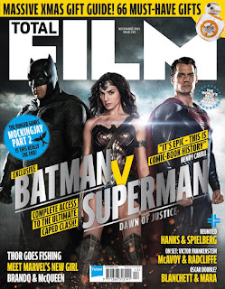
Batman vs Superman movie magazine poster shows the three main characters in the centre of the page with dark skies and light coming form behind. The poster shows the three looking very brave and dignified in their costumes. the colour scheme of dark colours including blue, red and black keep true to the original idea for the superheroes however the picture shows that they have been modernised. They have made the characters look very realistic in what they would look like today since that they originated from comic illustrations.
The fonts used are very bold and all in capital letters thus making a very big statement on the magazine cover. The title of the film Batman v Superman coloured in a steel type colour makes it stand out and for the audience to remember; steel also connotes that they are strong and indestructible.
The stormy, monochromatic background shows that danger is ahead. Since that the title suggest Batman v Superman will fight against each other, the characters are also positioned apart with wonder woman in between.
No comments:
Post a Comment